Pinnacle Chiropractic Wellness
Project Overview
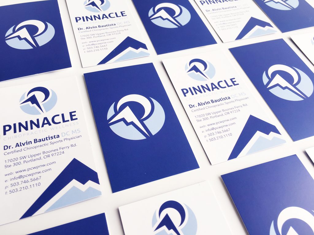
This branding project started with four key purposes: Prosper, Educate Achieve, and Knowledge. With an emphasis on helping others reach the pinnacle of their health, our solution for Pinnacle Chiropractic’s branding features uplifting graphics and trust invoking colors.
We decided on a versatile symbolistic logo reinforced with a friendly yet professional wordmark. The symbol is empowering – emphasizing continued growth until achieving your goal at your peak. This all comes together to form the Pinnacle circle and “P”. Circles convey positive emotions, power, and energy.
Feeling invited and having trust in your chiropractor is vital in welcoming their work, education, and knowledge – this is accomplished in tandem the blues, the strong slightly rounded type, and common professional sans serif.
Other key branding assets utilized are images of mountain ranges, mountain peaks, and blue mountain peak graphics.