Symposium Coffee
Project Overview
Symposium Coffee was in need of a complete brand refresh with the goal in mind to modernize and better communicate to their target market who they are and what they do.
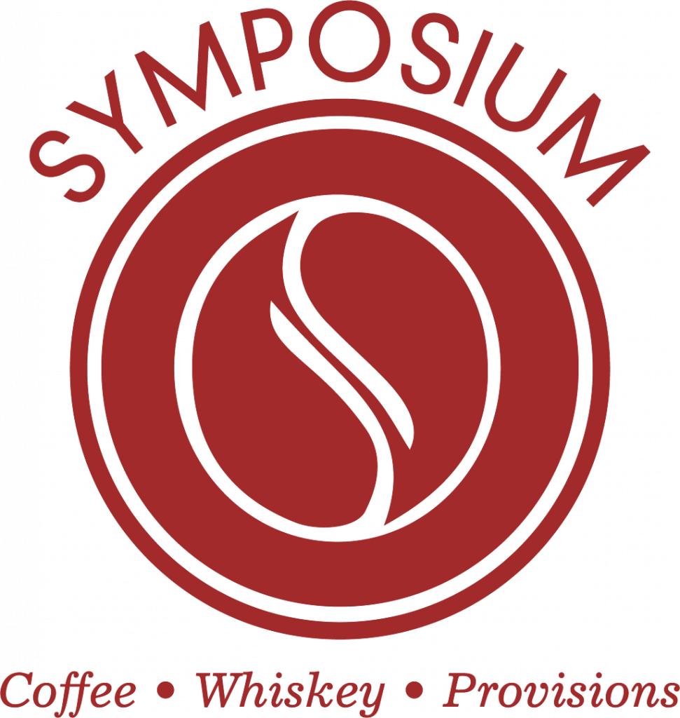
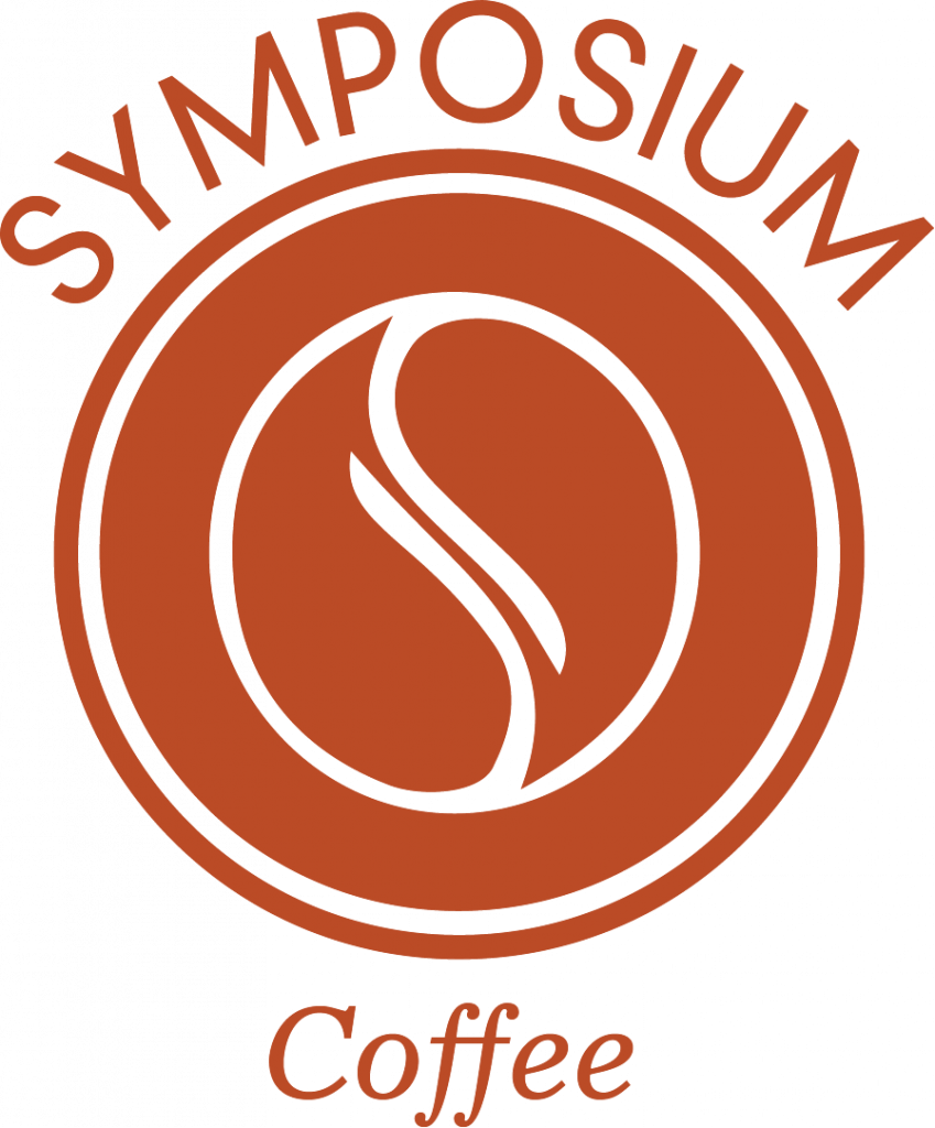
Symposium Coffee wants its brand to convey community and building relationships. For this, we opted for a circle symbol logo that also lists what they offer for a transparent message. Since they offer many different categories of products (coffee, whiskey, and provisions) we curated 5 distinct colors to represent different products. This includes their new main logo in “Symposium Red” and they previous brand green.
We packaged their main logo, shortened logo, coffee bean circle, and their classic icon in all of the colors.