We Got The Keys
Project Overview
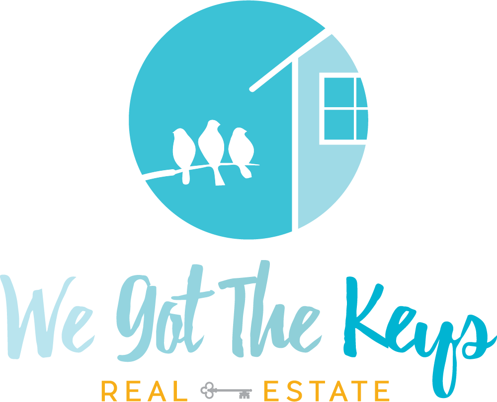
We redesigned We Got The Keys logo to bring to life what they represent. Our conception focused on what would best represent their ideals of making the process easy and fun for the client including the best part, giving them the keys!
Utilizing a combination of shades of blue with an accent of yellow, the color theory behind this invokes a sense of trustworthiness, energy, and cheerfulness. The free flowing water-color-esque type continues to strengthen the brand, becoming a strong standalone piece. The icon brings it all together with the house and birds, illustrating its industry and the type of experience a client can expect.


