Clark & Hartpence
Project Overview
Clark & Hartpence is true to their commitment to hard work and exhausting every possible outcome to get their clients the best results possible in their case. They desired a recognizable monogram logo that instantly communicates to current and prospective clients who they are.
Brand Identity Overview
The logo, features a clean and modern typography and a striking gold primary color. In crafting their brand identity, we focused on creating a cohesive visual language across all touchpoints.
By prioritizing simplicity and professionalism in every aspect of their brand identity, Clark Hartpence has successfully established a recognizable brand in a competitive market and established a strong connection with their clients.
Color
#DA9C2B
R218 G156 B43
#000000
R0 G0 B0
#FFFFFF
R255 G255 B255
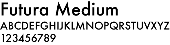
Title Font