Glaucomflecken
Project Overview
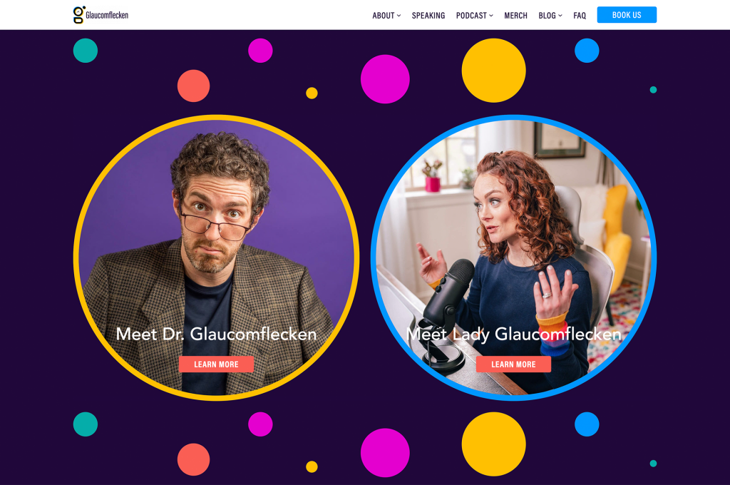
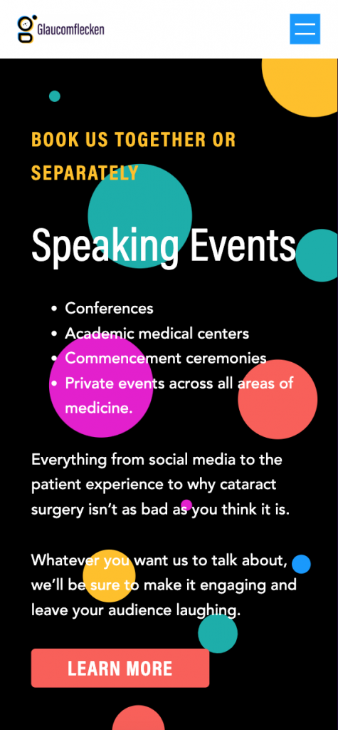
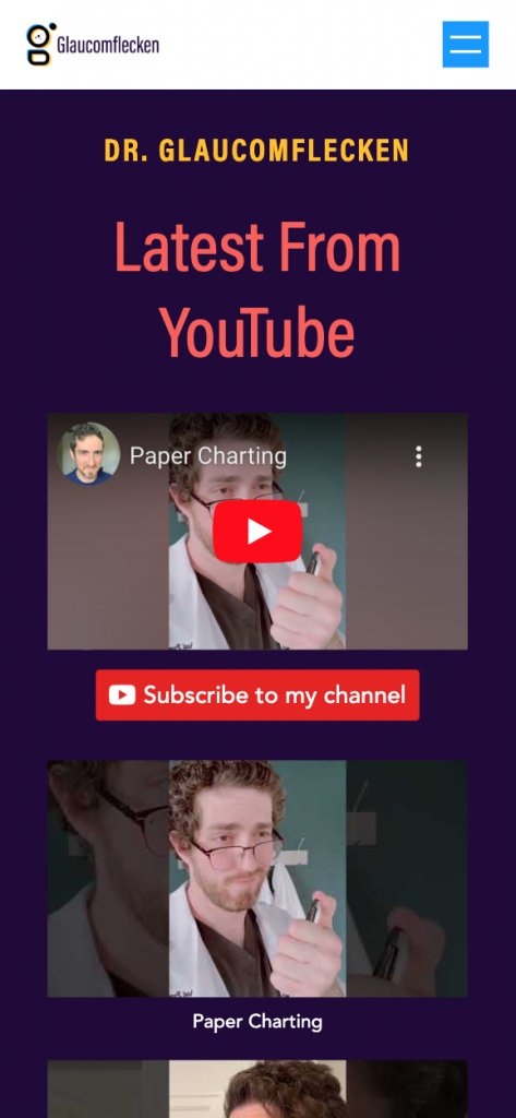
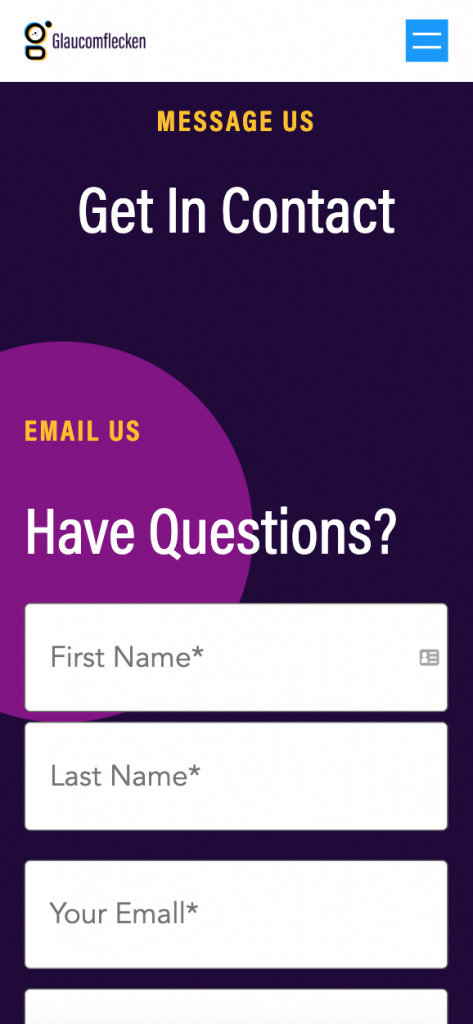
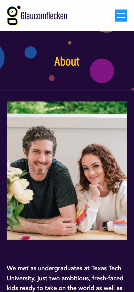
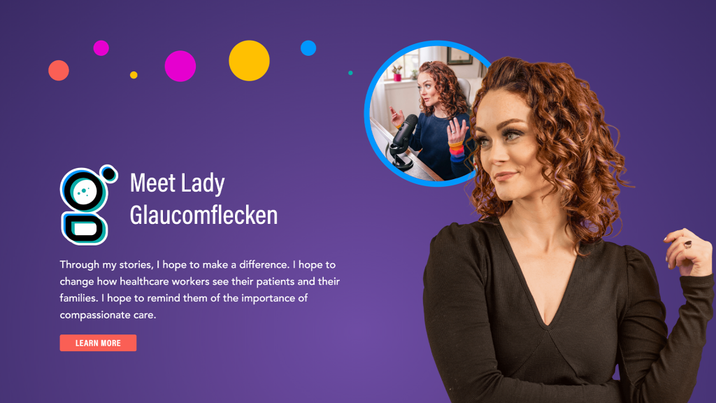
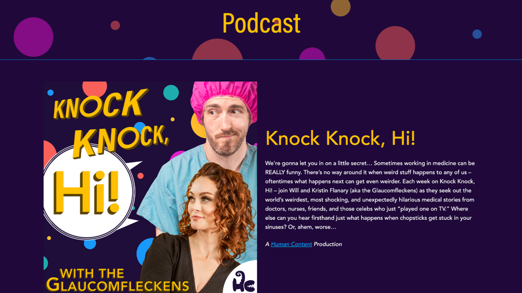
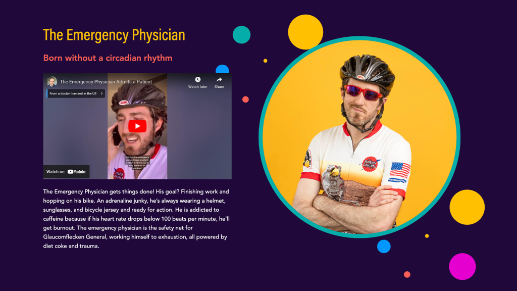
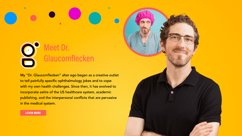
Alongside Glaucomflecken’s new brand, we launched a new website that would be able to support and scale alongside their large and ever-growing online following. The website needed to have the ability to showcase who they are, what they do, and provide social proof to guide users to book them for speaking events. It was important to promote that they share their knowledge through a variety of avenues.
Industry
Social Media
Deliverables
Branding Identity
Web Design & Development
Links

Brand Identity Overview
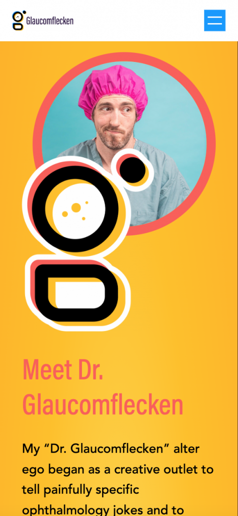
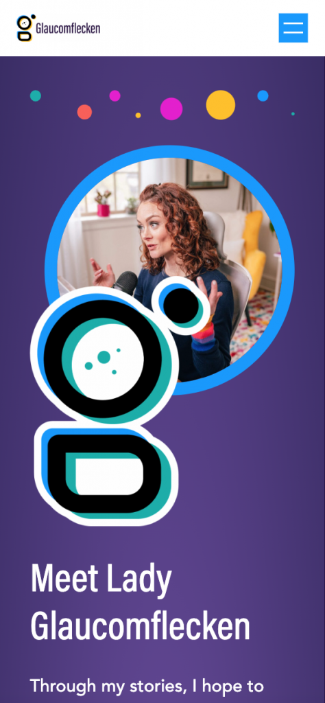
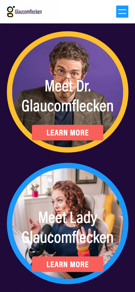
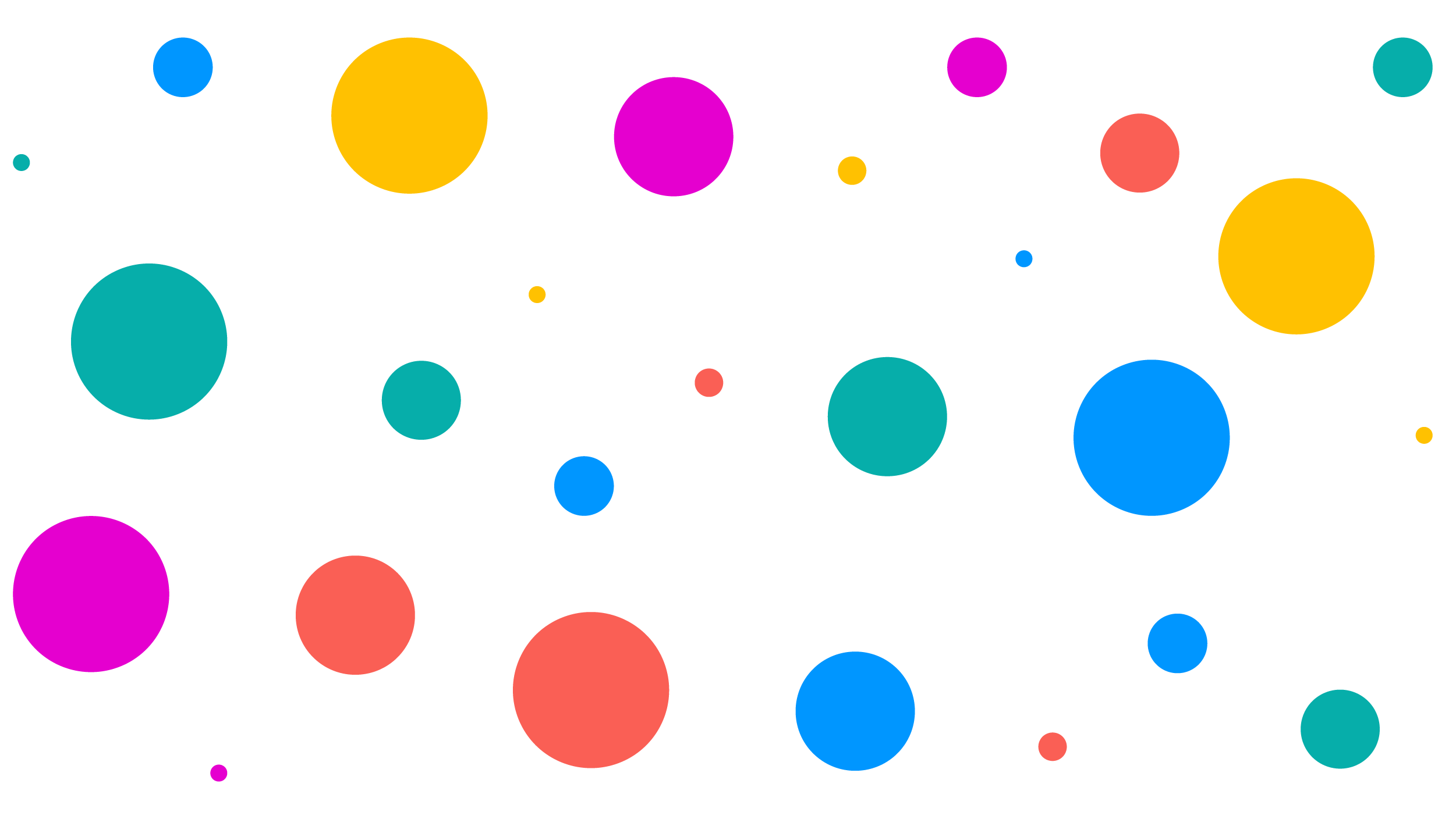
The main Glaucomflecken brand features a duo-colored logo. We kept this theme throughout Kristin and Will’s identities feature the same style but with designated colors to easily signal to users whose content they are viewing. To reinforce their separate identities, we designed stylized face illustrations to be associated with their specific content on social media. All of the colors can be found through their speckled pattern design reinforcing the brand identity.

Glaucomflecken

Color
Amber
#FFC101
R255 G193 B1
Amber
#FA5F55
R250 G95 B85
Amber
#0096FF
R0 G150 B255
Amber
#06AEAA
R6 G174 B170
Amber
#E500CF
R299 G193 B1
Title Font

Body Font


Web Design
Some of Will’s key attributes are playful and irreverent while Kristin’s are wisdom and hope. We guided the brand creation process through thorough questioning and heavily curated storyscapes (mood boards) to help us and the clients finalize a design direction before we dove into a bulk of the brand identity. We eventually landed on a brand identity that shared an overarching theme with separate but similar identities to represent Will and Kristin.
