Axis Healthcare
Project Overview
Axis Healthcare was looking for a clean and inclusive logo to identify their new team of professionals who come together to find better healthcare rates for their clients.
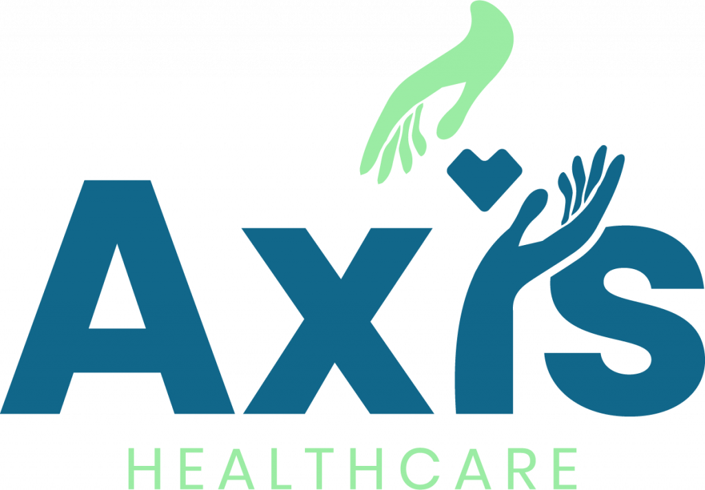
The logo features the sans-serif font, Poppins, to communicate their tenured experience in their field. The blue is to invoke a sense of trust while the green adds a pop of color to break up the blue and bring attention to the visual elements. The heart illustrates they work in healthcare while the hands surrounding the hands represent their team coming together for a common passion to fight for better healthcare rates.
The logo is a wordmark that contains all visual elements within the name of the company. The hands and hearts can be used separately as an icon and visual element to be used in branded mediums. The logo offers the freedom of being able to be adjusted and displayed in a variety of different situations whether the background is light or dark.

Deliverables
Branding
